During this term I had the opportunity to practice filming and remember some editing techniques. As we are studying media studies, our teacher told us to film a promotional video of our school. As normal, we started doing some research. We went to youtube and spent some lessons watching promotional videos of existing school. We thought it was going to be really easy, just take some shots of children and staff and that's all. But to be honest, the videos that we saw when we were researching were so professional, so we also wanted to do a great job. It took us five days to film everything. It wasn't an easy task because we had to speak to teachers, to students and also to the headteacher as we also wanted him to appear in our video. After filming everything we started editing with a software called Pinnacle Studio, it is the one that we are going to use for our film trailer. We used some editing techniques that we learnt last year in our AS course and we are really proud of our result. Here is the final production. Hope you enjoy! :) :) :)
Tuesday, 13 December 2016
Monday, 12 December 2016
Characters
I have really enjoyed preparing this popplet diagram. Here you can see what is the role of each of the member of the group and what they do.
Some days after creating this popplet I re-edit this post due to some changes. First, we decided that I was going to be also in charge of editing our trailer due to all the effort that I put on my research on the internet about good editing programs. Also we realize that we needed to add two new characters.
The boy is one of the protagonist of the movie and the women is will be the psychologist.
Location
My group and I have decided to film our trailer in El puerto de santa Maria principally because most of us live there so it is more confortable and easy to record near our houses.
We know this place almost since we were little so we don't have too much problem with the scenarios or with how to get to all the different places. Another reason of why we choose this location is because we did not have a very good experience from last year because we went to record somewhere 1 hour away from our houses so we didn't have enough time but also it is a solitary place with a very small range of habitants in winter and this was a problem in case we need an extra or we consider a new idea and we need more characters. Well this is a problem that this year we hope that we are not going to faced because we have chosen a place where we know a lot of people rather than a place where you cant even see someone in the street.
So definitively El puerto de santa Maria is a really good place to film and very confortable.
Thursday, 8 December 2016
Props and costumes
We have created a brief powerpoint in which it appear the majority of the props that it can be found in our trailer.
Some of them obviously are more important than others and each of them have a symbolism.
After recording our trailer we thought about creating a new post in which we put the props that we have used, those that we have not and those that you can see more.
Some of them obviously are more important than others and each of them have a symbolism.
After recording our trailer we thought about creating a new post in which we put the props that we have used, those that we have not and those that you can see more.
Wednesday, 7 December 2016
Shooting equipments
Well..today me and my team have been working on the possible equipment that we are going to use for filming our movie. The school will provide as with the camera and the tripod. We are thinking this year of including also an ambient sound microphone in order to have a better sound quality. Last year we also used our mobile phone to record some scenes. So it would be a good idea to include it in our film equipment. You will find all this information fully detailed in my prezi presentation.
Monday, 21 November 2016
Trailer titles
Here I have some possible titles for our trailer. Each of them has a small story.
Which means that each one has taken me time to think about.
- The boy and his motorbike
- The electric motorbike
- The challenge
- A deal is a deal
- The promise
- Saved by the dog
- Away of home
- Never say never
- An unexpected decision
- Unfortunately
- I told you
- Remember
- My friend treason
- Just do it
- Are you sure?
- Back to the past
- Forbidden love
In the next post that I will make you will see that I selected 6 titles and also that some of them came to my mind during the process of creating our plot.
Sunday, 20 November 2016
Plot
Hiya! Today in class we have been working on possible titles and plots for our movie. The most difficult part has been to come up with the titles as we had some clear ideas for the development of our movie. We came up with six different titles and possible plots. Here I took a picture of the paper we were working on.
Thursday, 17 November 2016
Logo design
Today I have been working with my team on some possible logos for the final trailer.
We have been contributing for example giving our opinions and making some comments about what we think about it.
In a long term it has not been a very hard task, but I have to say that at the beginning it was not easy just the idea of having to open our minds and think about some possible logos.
The following pictures are the result that we obtained in a certain time. I have notice that almost all of them have a black background and this is because our first idea was to have all of my logos with that color background. It was easy to create a slide in powerpoint, add the color and then use my imagination to find a picture on the internet that do has a white background or just no background, then copy or save it and post it on the powerpoint slide. The next step was to make sure that the picture looks more like an emoticon rather than an image and then find a place to put it.
We decided to put the name of the production bigger than the word 'studios' to make it more attractive to the general public. Also a normal font color that in the case of the black background is white to make more contrast. Another thing to realize is the volume of the letters, in all of them and in some more than in others to stand out the important word we edited to make it more dense.
It can be strange that the final logo does not have a black background because all of them above have it.
I have a personal reason of why I finally chose another background.
I think that it is because it took me so long to create those with black background and because I made a lot and all of them are similar it makes me think more about it and then I become to be less interested on black background.
Anyway this is our final logo. The name of our studios is 'Horse' and this is just because in the background apart from the wide variety of colors tones and the landscape you can see the silhouette of two horses.
Before finding the image that we were going to use we search on google images for landscapes.
Between them we found a sunset,and then in related images and we founf one of a jiraffe. Then we think of an animal that inspires us freedom and that we like and this is how we got this photo.
At the time of editing the title we realized that both colors black and white were nice above the background but putting the letter black would not be as attractive as putting it white because the horses are in black and it would not bee that good.
After having a talk with my teacher of media studies and my teammates, we got to the agreement of changing the logo.
We thought that what we had before wasn't a logo at all. It was more an image with two words on it. Also we realized that we name of the studio was inspired because the background picture is a horse in a sunset.
Trying to get a different design I made three more:
Wednesday, 16 November 2016
Search on Logos
Today I have been with my team mates researching about some of the films production logos that we know.
We have seen a serie of logos that already exist to take some ideas that can guide us to make ours.
What I most like of this production company logo is the sound of intrigue and the music so shocking that makes the audience realize that the movie is going to start.
Fox Searchlight Pictures
Now I would like to make a brief comment on 4 logos that I knew less and that are less powerful than the others.
From the four this logo seems the most original, I like how the four has been incorporated into the logo being what most draws the attention.
We have seen a serie of logos that already exist to take some ideas that can guide us to make ours.
First I am going to post the most known ones.
20th Century Fox
What I most like of this production company logo is the sound of intrigue and the music so shocking that makes the audience realize that the movie is going to start.
This is one of the most illustrious film studios in the world, which is found as expected, in Los Angeles. It began to produce films in 1914 and until now it has not stopped to work in successes. Artists such as Marilyn Monroe, Carmen Miranda and James Dunn have also produced such films as Agora, Avatar, Moulin Rouge and Lilcon, among others. She has also produced programs such as Glee, The Simpsons, and Family Guy.
Fox Searchlight Pictures
This is a film division of 20th Century Fox, which specializes in independent film and British cinema. And although we're used to movies funded by large-scale producers, I have to say that this company has produced incredible films, such as Slumdog Millionaire, which won the Oscar for Best Picture, as well as other great films like Little Miss Sunshine and Black Swan.
Pixar
Pixar has managed to look like a simple logo. What I most like about it is the idea of changing an I for a felxo to make it look different .
Pixar Animation Studios es una compañía de animación especializada en crear gráficos en 3D; dicha productora fue comprada por Disney y tiene su sede establecida en Emeryville, California. Sin duda recordaréis su pequeña ‘intro’ en la que aparece ese tierno flexo saltando sobre una de las letras del logo. Pixar ha creado desde fantásticos cortometrajes hasta tiernas y divertidas películas animadas como Toy Story, Buscando a Nemo, Ratatouille, Up y WALL·E; pero no solo eso, pues también lleva a sus espaldas 27 Premios Óscar, 7 Globos de Oro, 11 Grammys y 7 Premios Annie.
Metro-Goldwyn-Mayer (MGM)
What I most like about this logo is the black background with that style of letters and the idea of the lion being the only thing that moves and transmit sound.
Who does not know the famous head in which appears a roaring lion causing a rather intimidating effect. As many will know, this producer declared bankruptcy in 2010 after not being able to pay a debt of 4000 million dollars, but a curious fact is that this producer shuffles the possibility of merging with Lions Gate Entertainment. The MGM, which has been celebrating its ninety years since its founding (1924), has made possible famous films such as: What the Wind Went (1939), Ben-Hur (1959) and the famed film The Wizard of Oz (1939).
Universal Pictures
I consider this logo simple since they have used the name of the production company linked to the world ball in the middle of the universe.
This is a branch of production and distribution of cinema of the American company Universal Studios, which has managed to reap countless successes all over the planet throughout its history, something that seems to hint at its great head. And it has not stopped, from the mythical films of Steven Spielberg: Shark and Back to the future, to other more current as the musical comedy that so much like among the younger: Pitch Perfect.
Carl Laemmle, founder of this producer and immigrant from Germany, has gone from running a clothing store in Wisconsin, to being considered as one of Hollywood's architects. And it was on a trip to Chicago in 1905 that discovered the nickelodeon was very interested in the business of cinema.
DreamWorks
This logo is another of my favorites. I love the idea of the tranquility and the feedback that they want to transmit to the audience.
This film studio has produced and distributed both movies and video games and television shows; Is founded by Steven Spielberg, Jeffrey Katzenberg and David Geffen, who sold their company to Paramount for $ 1.7 billion to become independent again three years later thanks to financial support from an Indian-based corporation. You'll recognize DreamWorks for the famous comedy "The Fathers of Him" or the fun drama "The Terminal," starring Tom Hanks; Has also produced animated films such as The Prince of Egypt, Madagascar and the one that has garnered more success: Shrek 2.
Paramount
Paramount pictures has used a mountain to match it with the name of the logo.
Paramount Pictures has been one of the most important studios founded in the 1910s, as well as being the first to collaborate in the creation of dubbing. The company has reaped such films as Psycho, The Godfather, Flashdance, Sleepy Hollow, The Wall Street Wolf and Mean Girls.
Warner Bros
Warner have used the initials to form the logo of their production company.
This US producer is one of the largest in the world, as it has a large number of subsidiary companies. The corporate name is due to the founders, the Warner brothers. This producer was made with the rights of the famous novels of J.K. Rowling, Harry Potter, giving life to the seven films on the same story, in addition, Warner Bros has announced publicly that it is the film studio that has collected more in the history of the cinema; Has produced mythical films like Casablanca, The Exorcist and Harry the Dirty.

These are two other examples of well-known logos. on the left the one of colombia that they always use the same woman and on the right, walt disney, that they have used the trademark castle for the logo of their production company.
Now I would like to make a brief comment on 4 logos that I knew less and that are less powerful than the others.
From the four this logo seems the most original, I like how the four has been incorporated into the logo being what most draws the attention.

In this case, both Sony and Warp films have used a black background and a white color for the letter to stand out.
This logo is quite simple, they have used a single color for the letter and they have left the white background. To make it does not look so simple they have added a circle that I think that apart from being a decoration it is also to separate the two words.
Sunday, 13 November 2016
Friday, 11 November 2016
AUDIENCE RESEARCH
-How often do you watch romantic films?
Well, I use to see a lot of romantic films, around 2 or three per week.
-Do you like to watch them in the cinema or you prefer on tv?
I don't have any preference, sometimes I prefer going to the cinema because of the size of the screen and also because I can go with some friends. But it is true that at home it is more comfortable and I can watch them when I want.
-How often do you go to the cinema?
I use ton go to the cinema more or less once a week.
-What is your favorite film genre? why?
Romantic is my favorite film genre because I am a very romantic person, I really like to put myself in the role of the character, also they use to have happy endings which make me feel comfortable.
-Which subgenre do you prefer? Romantic comedy, Romantic drama or Romantic action adventure and why?
I like the three of them but it is true that I prefer ones more than others depending on how I feel in that moment. But if I have to choose one I prefer romantic drama because they usually have happy endings.
-From your point of view, what makes an effective trailer?
I consider a good trailer when the story is good and original. I thing that the aim is that the audience feel satisfied when they finish watching the trailer.
The end
Tuesday, 8 November 2016
Marketing in the media area
Promoting films
Warner Bros Marketing

Do you want to be successful in promoting a movie?
As we all know, this depends very much on the quality
of the trailer, on the chosen scenes and also on the soundtrack of it.
Hundreds of trailers, teaser, posters and promotional
images from different films come to us every day and many of these resources go
unnoticed for most of the audience
That is why many producers opt for certain marketing
techniques more striking.
For example:
For the promotion of the movie "Carrie" they
released a video recorded in a coffee shop.
So far all normal, but the "funny" came
later, when a girl gets angry with a customer.
It was then that all those who were having a coffee
quietly saw something they did not like too much.
The young woman's anger began to cause the furniture
of to move violently and one of the people rose in the air as if by magic. The
girl turns out to have telekinetic powers.
And although everything was false, everyone that was
there get surprised. Here is a successful marketing technique as the
"Carrie" promotional video managed to get more than 58 million hits
on YouTube becoming a viral that toured all kinds of social media walls.

(one of the best and largest company of
production/distribution in the world.)
what makes their films successful?
-They use well known actors
-They have unique storylines
-They aim a wide range of
audience such as children, teenagers and adults.
Marketing & distribution?
-Warner Bros. pictures
produces and distributes a wide number around 18-22 films each year.
-They distribute their films
by advertising new releases and cinema titles on billboard's, trailers,
adverts, newspapers...etc.
-They have also sell films in
Blu Ray.
Tuesday, 25 October 2016
Analysis of me before you trailer
The first trailer that I am going to analyse is a 2 minutes and 18 seconds trailer called 'Me Before You', a romantic drama film directed by Thea Sharrock (an English director) and produced by Karen Rosenfelt & Alison Owen.
The movie was published on the third of june, 2016 in the United States and it has raised more than $207 million in the world. Also it has been distributed by the warner Bros. Picture.
Me before you has received mixed reviews by cristics and more positive from the audience.
This film from the trailer promises a new great love story, those that hurts and would make that anyone look for a love like that, clearly is a feminine film. This movie is made to make people cry also because even though you have a cold heart this story about freedom, love and meet someone will make you feel at least a bit sad. In that sense the film 'me before you', is very romantic, emotional and filled with a lot of drama which make that people connected with their emotional side completely in tune with the story.
Just at the beginning of the trailer we can see three logos of different companies of production, apart from the one that I said above, the warner bros you can also look that there are two more, Metro Goldwyn Mayer and New Line Cinema.
Well, the last one that I have mentioned was first a particular distributor, then a few days later it becomes to produced independently and finally the New line cinema is a subsidiary of Warner Bros.
The name of Metro Goldwyn Mayer comes from the three companies that form a corporate merger to create MGM studios, and this are:
-Metro Picture Corporation
-Goldwyn Picture Corporation
-Mayer pictures
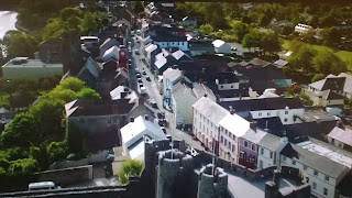
Continuing with the analysis, after the logos, the opening of the trailer is an aerial shot which shows clearly to the audience where the scenes will take place. This shot can be sometimes confused with a establishing or wide shot. Also I have notice that most of the time this types of shots usually comes together with some music about nature or whatever, but in this case it is dialogue because you can hear since the beginning the voice of the characters.
Since this shot and also in this scene you can hear clearly the mixture of music and dialogue.
Also we can say that the film will take place in the countryside, because it does not look like a city at all and also because of the rural houses that you can see from that point of view.
Another point which I just noticed is that both of the scenes have a small duration, at least in comparison with other trailers which spends a certain time with each aerial shot. Which is normal due to its purpose.
Carrying on, some Over the shoulder shots will be found to establish the position of each character and get the feel of looking at one person from the others point of view.
This shot make you feel like you are talking with the oposite character.
It is common to cut between this shots during a conversation.
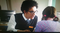
Here I put two examples in which you can realize that the protagonist, Louisa Clark appears in both.
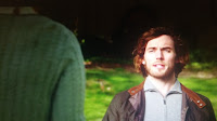
In the first picture she is trying to find a job persuading the man telling that she accepts anything and finally in the second picture she found a job which consists on taking care of Will Trainor, the main character.
In that specific situation he still a bit confused and with negative mind and you can see this when he say that people go to that place when they get tired of living. By the opposite she is really happy and tries to transmit some happiness to him.

Later there is an eyeline match shot, this consist on focusing first the character and then cut to show what the character is looking at. Here I post two examples. In the first case in the right the camera first focus the woman and then cut to show the place where the she is going to be working.
Around 2 seconds before this shot you can hear that the soundtrack is a background dialogue matching with a instrumental music.

At that moment she is like impressed with the situation and she says that she has never worked in something like that but she is sured that she will learn.


By the other hand we have the pictures of the left. Right in this moment, he, Will Trainor , the man who need help is going to meet the person who is going to be taking care of him apart from other thing. It seems that to will it has not been a great moment, he said that his brain is not paralyzed, as saying that he can speak.

Right in this long shot the music become to have letter and the soundtracking changes completely for a happiness one.
In general in turns to another emotional mode when the camera changes from focusing the mid shot of the girl entering through the door to focus another one but with the man sitting on the chair


Between both picture you can notice that the key lighting changes from a hight lighting to a low lighting. The right examples show a different facial expression than the left one. She is happy so it is coordinated with the ambient color and the sound, but he is not, you can see this easily and also you can realized that maybe he feels normal but he don't want to show it. Here we can be talking about body language which indicate how a character feels towards another character or may reflect the state of their relationship.
You can clearly see that he did not assume yet that someone is going to be taking care of him. Probably this shows lack of maturity.

If you hear you can see that the background sound in this part apart from the music is the voice of she talking with her friend but not coordinated with the scene.
Like you can see after, it belongs to the scene of both friends in the bed. She is telling to her friend that he hates her.
Some used of high angle which shows inferiority and two shot on this part of the trailer.
This is the scene where the background noise comes from.

In this part of the trailer he will change his physical appearance unexpectedly.

The main purpose is that the audience finds the change in the character. As if it becomes a totally different person. It changes from a solitary man who never smiles to a smiley person who wants to live the life.

Here is the change.


Something happens with Will that makes that she feels scared.
A short tracking movement at the moment when she is crossing the door.
Looking at this image you can see what she feels. She will be with and helping him for ever.
At the end he tells her that she is the reason why he wakes up everyday in the morning.
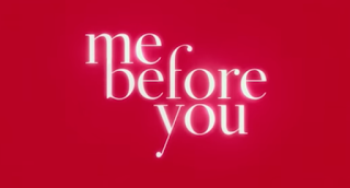
In this trailer the audience will know the name of the movie when the trailer finishes.
And then a small sentence promoting the film.

Monday, 17 October 2016
Analysis of paranoia trailer
Before analysing this trailer I would like to say that this one wouldn't be as long as the second one, and this is because the genre of Paranoia Trailer is thriller not Drama or romantic.
This is only because the final trailer that I kneed to create for the last post of this blog will be a mix of drama and romance.
I just choosed to analyse a trailer of a different gender to search more inside a not familiar gender.
First thing to know:
It is an American Thriller film directed by Robert Luketic, Produced by Alexandra Milchan, Scott Lambert & Deepak Nayar , Screenplay by Barry levy & Jason Hall and edited by Priscilla Nedd- Friendly.
Sunday, 16 October 2016
What makes a good trailer?
There are a few thing that I have found about what makes a good trailer. Like:
- Starts slow and ends fast, this means that it does not matter if you only have 2 minutes and 30 minutes to explain the film, the beginning should always be calm.
- The rise of music in some scenes, for example of explosions.
- Uses a narrator to read us what we can see on screen. This is a non-negotiable characteristic of 99% of the trailers.
- If it is an action movie, shows the best scenes of special effects. If it's a comedy, compiles all the funny jokes. people should learn this trick, but most of the times they end by going to the cinema to leave the room exclaiming: "if the best was in the trailer".
- All actors may shout. The voice of the actors can only appear in two forms inside a trailer. If they are in the screen we might see them shouting : run, now, be careful, more wood, etc, are some examples of perfect valid exclamations. If the characters does not appear in the screen they might use any monologue in which the guionist have been making a lot of effort and they will match the images shown creating a poetic composition.
Wednesday, 5 October 2016
Difference between a TRAILER and a OPENING SEQUENCE
A trailer is a promotional summary of a film.You can find a trailer up to 5 minutes long . The main objective is to attract the audience with some intrigating scenes that make the people want to see the entire film.
An opening sequence is the starting of a film and that is why you will find it at the beggining of the movie. In this part you will look the title of the movie and the introduction of the characters.
An opening sequence is the starting of a film and that is why you will find it at the beggining of the movie. In this part you will look the title of the movie and the introduction of the characters.
Subscribe to:
Comments (Atom)


